MAP Interactive Charts gives registries and registrars a clear view of DNS Abuse activity, including phishing and malware trends, mitigation rates, response times, and registration types. Built on Tableau, the charts are easy to explore, download, and share.
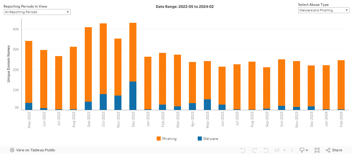
Aggregate Trends
This chart provides a high level view on how much DNS Abuse has been identified by our methodology, and how it’s changing over time. It shows the absolute volume of unique domains our methodology has identified are engaged in phishing and malware, broken out by category.
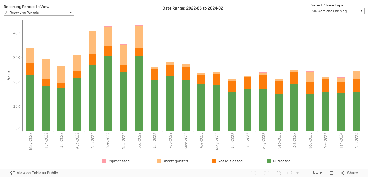
Abuse Mitigation
This chart is intended to demonstrate how much DNS Abuse we observe as being mitigated on a monthly basis. This results in four labels: Mitigated, Not Mitigated, Uncategorized, or Unprocessed. For additional details and usage guidelines, see the FAQ.
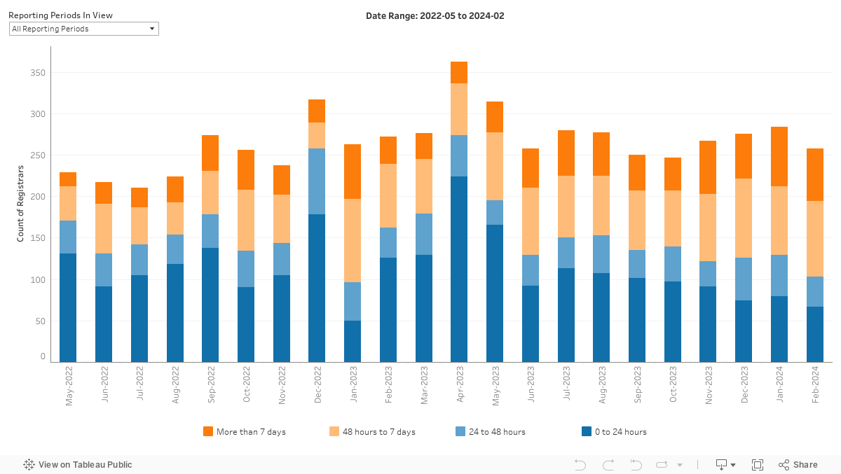
Median Mitigation Time
This chart is intended to show the observed time taken to mitigate phishing and malware, and how it is changing over time.
For the domains that our methodology determined were mitigated, this chart shows how many unique domains were associated with a registrar credential that had a median time to mitigation in each category. For additional details, see the FAQ.
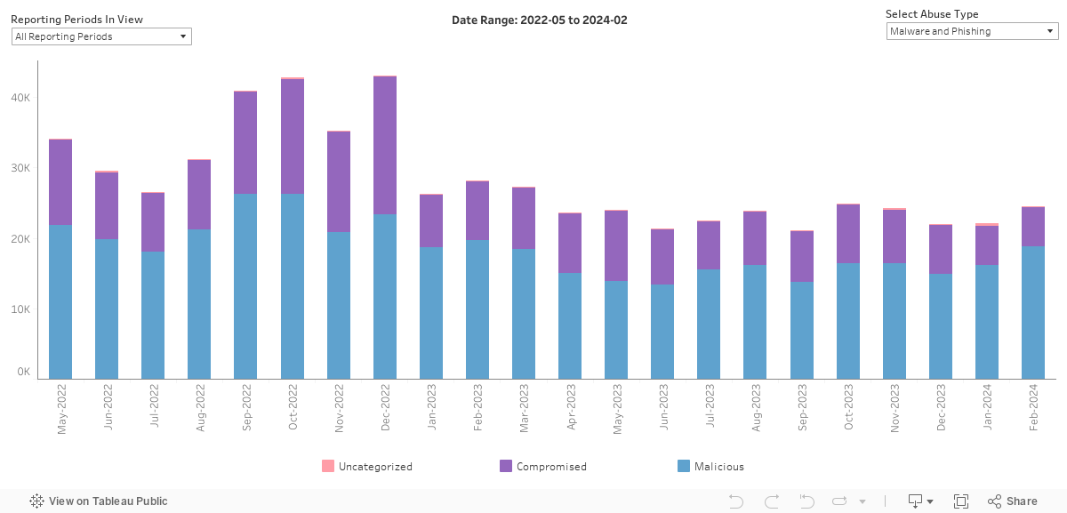
Malicious vs Compromised
This chart is intended to show the observed registration type (malicious registration or a benign domain associated with a compromised website) and how this is changing over time. This is an important distinction because it impacts which mitigation action is most appropriate, and which actor is best placed to mitigate.
Domain names that have been maliciously registered for the purpose of DNS Abuse are typically more appropriate for mitigation at the DNS level. A benign domain name that is associated with an issue of compromise is typically inappropriate for DNS level mitigation due to the associated collateral damage. For additional details on labeling, see the FAQ.
Sign Up to Receive NetBeacon Institute Updates
Cookie Consent
NetBeacon uses cookies to improve your experience on our site. By using this site, you consent to cookies.